As a logo designer, you need to constantly stay in the know so as to attract clients. Brands want to tell their story and represent themselves in a creative way, but it is also important that they stay relevant. The company logo is a great place to bring out a brand’s personality and communicate with consumers, so as a designer are you well BTS bighit informed on design trends? We have observed logo design trends and patterns in the past years and come up with the top 10 that are most likely to stay in the market in 2016. Hopefully, you will gain valuable information to ensure that your portfolio is up-to-date.
1. The flat design.
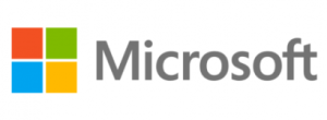
The design has been around for a while. The characteristic that makes it a hot trend is the simplicity and functionality of the design. A good example is the Microsoft and Netflix logos. These companies used to have different bold designs a few years back, but when the flat style hit the market, these companies quickly adapted and decided to represent their brands using simpler, minimalistic logos. Apart from the fresh style, flat designs also look great on any device. We all know how important it is that we create designs that are compatible with mobile phones and tabs since they are more commonly used than computers.
2. Minimalism.
It is also not new and has been slowly taking root in all areas of design, whether it is web or interior design. The preference for minimalism in design started in early 2014 and the rate at which the style has gained momentum is sure to make it a hit in 2016. The difference between minimalism and flat designs is very little, with designers using minimalism to attract a site visitor’s attention to a specific spot on a flat design. To put it simply, minimalism is just a slight improvement on a flat design.
Let’s take an example from e-commerce, where you can choose to design a website that has a plain white background against plain black texts and a transparent navigation menu, but very vivid and colorful product images in the gallery. This cuts the chances of creating distractions in the name of prices, product titles or descriptions. The site visitor’s attention would be captured on the things that really matter; the products.
You can easily use this style to create a stunning logo that cuts to the chase, eliminating all distractions and bringing the viewer’s eye to your client’s brand and message.
3. Ul- friendly typography.
We had earlier mentioned the importance of creating logos that are mobile friendly. Brands have noticed that people have a preference for browsing on their phones than laptops, something that will prompt them to shift to the sans-serif type of font when designing their logos. This font looks great on any screen, size notwithstanding.
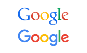
A great example is Google’s logo redesign in September 2015, where they changed from their usual serif font to sans-serif. Their own team of designers was able to redesign the font so it would be scalable on any device. They also came up with the colorful four dots that are used on Google products and apps during transitions.
4. Line art.
Ah, yet another design from 2015 that has firmly stuck. These designs are simple and clear, mostly characterized by thin black lines that maintain the same thickness. Food and coffee shops have a preference for the line art kind of designs. Logo designers usually try to break the monotony by adding a few graphics, while others get playful and creative with the plain lines to come up with stunning logos.
5. Stacked text.
While conservative designers may hold on to minimalist designs that have as solid color and simple, plain texts, some choose a more bold and different path where they stack the text in a vertical shape. This is a bit ‘wild’ but it definitely catches the eye if beautifully done. Some logos incorporate horizontal and vertical texts, which is another break away from the norm and it most certainly works for some logos.
6. Mixed up.
It is a slightly resembles stacked text, but it gets a bit more playful. The logo is still text based, but the designer may choose to play around with some letters to create an outstanding contrast. For instance, one or some of the letters could have a different font, but one must always be in simple plain format to avoid confusion.
7. Negative space.
Just like the others, the trend is not new but it makes the list since it has maintained relevance. This style draws from the unused white part of a logo and creatively brings it into the design. The NBC logo is a perfect example of a design that has used the negative space. In 1959, they changed their logo to feature a peacock spreading its vibrant colored feathers.

8. Hand drawn.
The style definitely gives the designer more freedom and a chance to make a logo that adopts a less serious tone when compared to the minimalist design. Although we are in a digital world, some clients still prefer the hand drawn flair since it has a bit of a more personal approach. These would be the clients whose brands can use a lighter approach to attract a certain demographic. We can use a kids clothing line company as a good example. The brand can get away with a logo that has font and cartoonish features.
9. Modern retro/ vintage.
It is yet another style that will definitely remain in style through this year. It involves creating something new by combining some known parts from older logos. The new design is definitely eye catching and would draw a reaction from the viewer. Although they may not have the serious minimalist look, these kinds of designs are great for bringing out a brand’s playful or crazy and fun personality.

10. The dynamic style.
It has been in existence and has kept making remarkable appearances in logos over the years, thus earning a spot in our list of 2016 trendy logo styles to watch out for. A dynamic logo is one that may constantly be changed but would still maintain aspects of the original style, so the identity of the brand never changes.
USA TODAY has the best example for a dynamic logo. Although the branches may have differently colored texts on their logos, you can still identify that they are part of this company since they have an identity that they hold on to.
The Recurring Theme.
The flat design is the most likely theme that will keep recurring in 2016. Google seems to have influenced a lot of brands, with most having some variation of the flat design in their logos.
Flat themes tend to give the designers a chance to represent brands in a simple, sophisticated way. They creatively use a few elements to come up with stunning and unique identities for different companies. The shift to this style started in 2015 and is not likely to stop this year.
Our Final Verdict.
Well designed logos are a great way to give your brand a different outlook, making it easier for you to get noticed in this flooded market. Of course getting noticed is the first step to winning a customer over, so you must ensure that your designer is well informed on emerging logo trends. This way, they will be able to design a relevant logo that will represent your brand well.
Are you in need of professional logo design services? Chicklet Marketing has mastered the art of creating quality logos for businesses. Our goal is to ensure that our client’s logo captures their brand message and values in a way that is both relevant and aesthetically pleasing. Do not hesitate to contact us for further information.
We are always happy to hear from our readers. Is there a trendy design that we missed? Feel free to let us know about it in the comments section!

