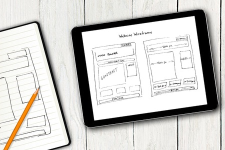
As web designers, we may differ on a few issues when it comes to website building, but there are some common fundamentals we all abide by. From the amount of white space to the quality of images used, there are things that we focus on to come up with websites that engage the user in the best way possible. For example, how clear is your call to action (CTA)? Is your site optimized for the search engines? Today we closely examine the basics that must be prioritized for a successful website design project.
1. Space
Lately, we are using lots of space to enhance the user’s experience. A well organized website is easily read and understood and the good news is that you can achieve this when you know how to correctly use space.
From leaving open spaces between lines of text and paragraphs, we often aim at creating the illusion of perfect symmetry. The best way to achieve this is to use similar spaces for similar items. What this means is that you should be consistent in the amount of space you put between texts, paragraphs and images.
The aspect of space also comes in handy when you need something to stand out. An image that is surrounded by lots of space attracts attention and appears to be more important than the one that seems to be squeezed in between texts. Note that the space does not have to be necessarily white. It could be the color or texture of the background, or it could simply be the lack of items that would otherwise cram up space.
Correct usage: Start by enhancing some key elements such as the navigation menus. Ensure that each button can clearly stand out by using lots of spacing between each element. The result is an enhanced user experience that goes a long way in attracting site visitors.
2. Simple Navigation
If the navigation on your site is complicated, you are definitely chasing away some valuable users. The easier it is for one to navigate through, the more they are likely to stay and interact.
How can you ensure that navigation is made easier? Keep things simple. Unless the site requires a lot of navigation items, keep everything to the minimum; 5-10 menu navigation items would sufficiently do the trick.
The tools used for navigation also play a key role in creating a navigable site. For instance, parallax scrolling has lots of arrows that direct the user and generally make it easier for them to stay on the site.
Some common examples of navigation include the Zolas and Anet designs. While the former is simple and has clearly placed buttons, the latter design tends to have more flair, and employs a bit more creativity. Each would work for a site as long as the designer knows how to marry the site goals with the style that they have chosen.
Correct usage: We cannot stress enough on simplicity! The user should have a clear idea of where they are, how they would go back home and how they would get to their page of choice.
3. About Us
A good website does not leave questions in the mind of the viewer as to who owns the site and what it is about. Unless you are an established company that is already well known, it is imperative that you properly introduce yourself.
This should be done on a page that clearly outlines who you are, what you do, your goals and even a bit of a history about your company. This page can also be used to showcase some customer testimonials and their stories regarding your company. You could also use it to link to your social media profiles and/ or any other pages that are relevant to your site.
Remember to keep things simple, fresh and interesting. You do not want them to get bored from the word go, it would hurt your chances of converting them into repeat visitors.
Correct usage: Be fun, have a little personality. You could include some team photographs or biographies, but make sure that you are in line with the kind of company image you want to portray.
4. Contact Information
Your site design should be able to display contact information in a clear way. You could either have this information on a Contact Us page together with some other information, or it could appear as a header on the main page. It should always be very visible and legit. It would be unfortunate if a user tried to use your contact information only to find that the number does not exist or it is out of service. This not only kills your credibility, but it also limits your chances of getting the person back to your site as a potential client.
Correct usage: Have a physical address for your business if possible. Keep this information at a location where it can easily be found and above all, consider having a way for site visitors to contact you directly either through a telephone number or via email.
5. Call-to-Action
At the end of the day, the website should be able to earn the owner good revenue. The site visitor can only benefit you if they follow your call to action, so be very clear on what you need them to do.
Start with the web design, ensuring that it focuses on leading the visitor towards what you eventually want from them. You could cleverly use color, space or contrast to lead the reader’s attention towards your call to action.
A good example is Connect Mania which directs users to download an app by guiding them to the app store through a clickable space on the landing page. Some opt for the sign up page which works perfectly if it has been properly sizes and is easy to fill out.
Correct usage: Clarity is key. Download, Sign up, Buy now, Stream now… These are perfect examples of how you should be clear in what you are asking your viewer to do. Visibility and timing are also very important, including the color of the button that one needs to click on.
6. Search
When you have good content on your website, it automatically follows that you will have repeat visitors who would want to view previous posts or items. This is where the search button comes in. Make sure that it is placed on the site in a subtle but clear spot for the user to easily see. The search box should also be sized according to the type of items one is likely to search for.
Correct usage: The most common location for the search box is the the top right corner, so you might want to do the same for easier finding. Also, make sure that the box design is simple and easy to type in.
7. Informational Footer
A footer allows you to communicate with your site visitor without creating a distraction in the web design. Since it is placed at the very bottom of the page, it is an ideal location for a map, important links or contact information for your company. Use the space in a smart way, keeping things simple and relevant. Whether your style uses links or buttons, ensure that it is easy to use and does not confuse the user.
Correct usage: Smart web designers combine most of the above mentioned elements to come up with excellent footers. For example, the search box could be placed at the top of the page, in the navigation and again repeated in the footer. It can also be used to introduce new elements that could not be logically placed elsewhere on the main page without muddling up the design.
8. Style for Buttons
They should never blend in with the background, but should stand out clearly as buttons. Consistency when it comes to shapes and colors helps a lot when one needs to navigate through your pages. Although the task of coming up with unique buttons for your site is not simple, a design kit would come in handy when things get tough!
Correct usage: Be unique and consistent in the colors, textures, shapes and hues that you choose when developing your site buttons.
9. Web Fonts
Gone are the days when we were only limited to Arial and Courier types of font! Nowadays we have so much to choose from as web designers, of course as long as the they are compatible with the site purpose. Using a web font service is a great way to rank well with search engines, instead of relying on designed images that bring about compatibility and licensing issues.
Correct usage: Go for an affordable option such as Google web fonts to get some interesting type faces into your primary design without denting your pocket as you pay for licensing.
10. Images
You should never underestimate the ability that images have when it comes to engaging site visitors! Use relevant infographics and photographs to break boredom, attract attention and drive the point home. Be very selective in the types of images you go for. We always advice against going for too many stock images so that your website doesn’t end up looking like a bunch of others online.
Correct usage: Employ the services of a good photographer to come up with fresh photos for that unique aspect. An illustrator will also create good infographics that cannot be found elsewhere. A customized look is always better than something that looks like it was borrowed from another site.
Conclusion
To summarise it all up, you need to be careful when designing so that the space, call to action, navigation, contact information, about us, search, footer, web fonts, images, and buttons are clearly styled for ease of use. You have the ability to make or break the whole web designing project by the way you handle these ten fundamental elements, so make everything count!
Chicklet Marketing has a dedicated team of experts that would be happy to take on your web designing and come up with an incredible site that best represents your company. From small to large businesses, we have always been consistent in the way we tailor sites that cater for each business’s unique needs and purposes. Do not hesitate to contact us for more information.
Do you agree with our ten crucial elements for a good website design? Leave a comment below, we would be happy to hear your views!